Brewing User Experience: Lessons from a Coffee Shop
In the ever-evolving landscape of user experience design, inspiration can be found in the unlikeliest of places…

In the ever-evolving landscape of user experience design, inspiration can be found in the unlikeliest of places…
"User experience" (UX) and "user interface" (UI) design have become ubiquitous terms - usually discussed in the context of websites and apps. But what if we told you that these principles extend far beyond the confines of the digital realm, finding resonance in the everyday operations of a neighbourhood coffee shop?
Welcome to the world of Piccoloco, a place we once came for the coffee (the best in town) and stayed for the experience.
Front of House - The Visual Appeal
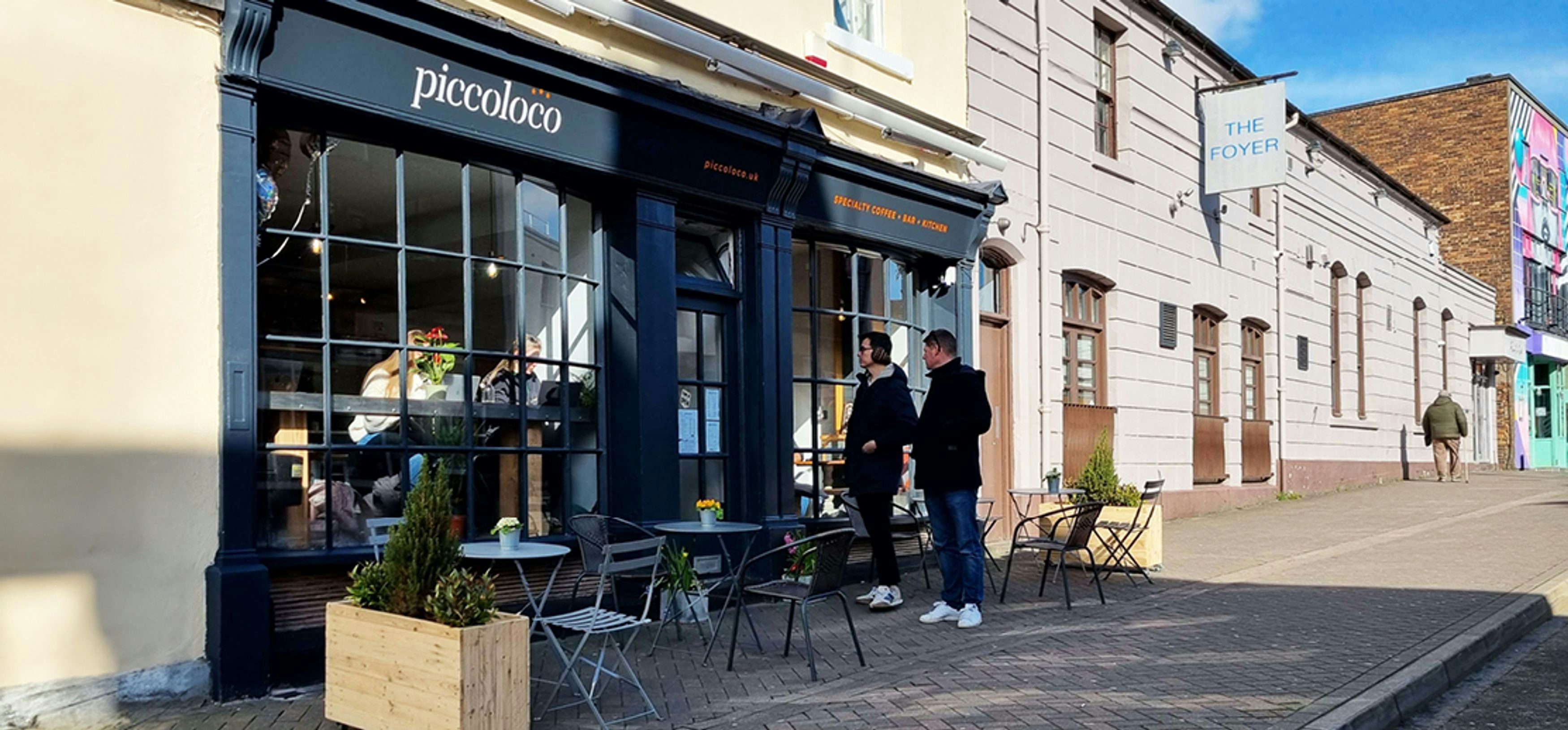
Much like the homepage of a website sets the tone for digital exploration, the exterior of Piccoloco serves as the initial exhibition of its brand identity. When the new management took over, they made the bold decision to refurbish the shop's interior and exterior signage, aligning them with the branding of their beloved mobile coffee shop. While the renovation meant temporarily halting revenue streams, the gamble paid off handsomely.
The revamped shop window now acts as a beacon of consistency. Passers-by can’t help but notice the cosy coffee shop nestled on a bustling street corner. Its frontage, a canvas of warm wood tones and alluring signage, beckoning them to explore with promises of artisanal brews and cosy nooks. This is Piccoloco, a haven for coffee aficionados and casual caffeine seekers alike.
Usability - Arranging the Space
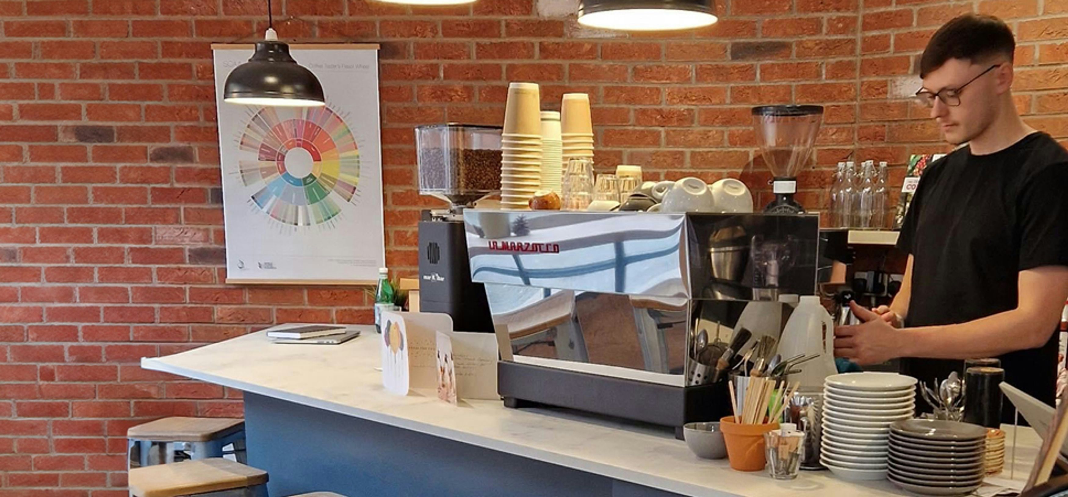
Step inside Piccoloco, and you're greeted by a symphony of aromas and the hum of friendly chatter. But beyond the sensory delights lies a carefully orchestrated space designed to enhance the customer experience. Take, for instance, the seating layout—a subtle yet crucial element in fostering comfort and friendliness.

In the early days, the Piccoloco team observed a crucial user quirk; despite ample seating, certain configurations discouraged patrons from settling in. A tweak here, a rearrangement there, and voila—the addition of a mere foot of space between tables transformed the ambiance, encouraging patrons to linger a little longer. Just as optimising website usability involves tweaking navigation and experimenting with layout to guide users seamlessly through their digital journey, so too does Piccoloco finesse its physical space to cater to the needs of its clientele.
Soft Launch - Testing the Waters
Launching a new venture is often a voyage into uncharted waters. For Piccoloco, this meant navigating the seas of culinary experimentation and sit-in customer preferences. Rather than diving headfirst into a sprawling menu of gourmet delights, the team opted for a soft launch strategy—a curated selection of offerings designed to tantalise taste buds and gauge demand.

The result? A resounding success. By embracing the ethos of iterative improvement and gathering feedback from patrons, Piccoloco not only refined its culinary offerings but also honed its operational efficiency. Much like conducting user testing in web development to fine-tune interface elements and iron out glitches, the soft launch served as a proving ground for delighting customers and refining processes.
Hierarchy of Information - The Piccoloco History Book

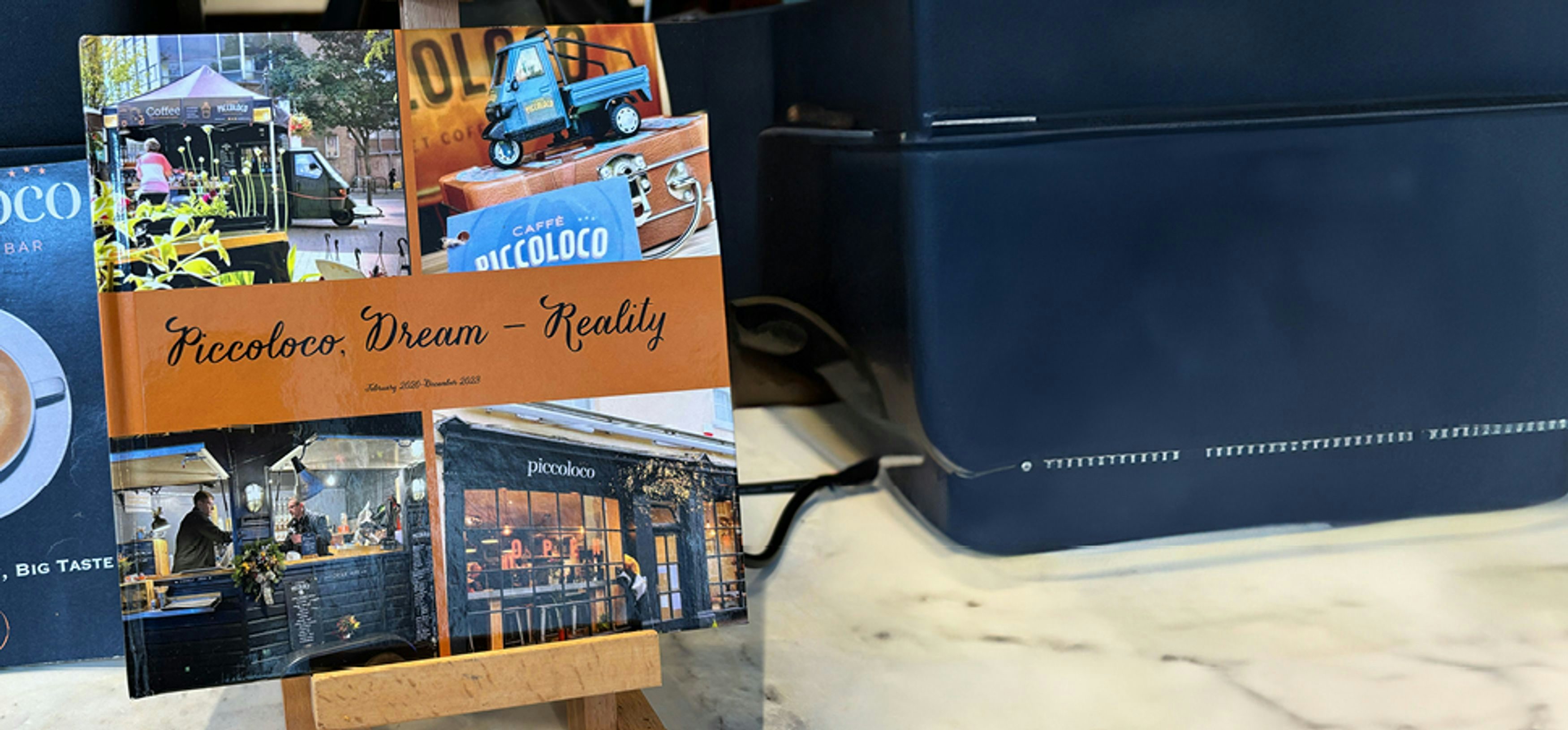
Nestled on Piccoloco's countertop is a humble artefact—a small book chronicling the company's journey from TukTuk to Horse Box to shop. Positioned strategically, it offers a peek into the brand's heart and soul.
As with website design hierarchy, everything has its own place of importance. It’s not as vital as browsing prices, but the History Book’s careful placement invites patrons to delve deeper into Piccoloco's narrative. Just as an "About Us" page qualifies a brand's story, this book encourages patrons to connect with Piccoloco's journey, setting it apart from chain competitors. As customers turn its pages while awaiting their beverage, they become part of the brand's ongoing narrative, enriching their coffee experience beyond the cup.
Visit - Repeat - Advocate
From the welcoming embrace of a local coffee shop to the seamless navigation of a well-crafted website, the principles of UX/UI design transcend digital boundaries, enriching our daily interactions and shaping memorable experiences.
So, the next time you find yourself savouring a steaming cup of java at your favourite local haunt, take a moment to appreciate the parallels between the artistry of coffee culture and the science of user experience design. After all, in the quest for the perfect brew, every detail—from the layout of tables to the aroma of freshly roasted beans—plays a pivotal role in crafting moments of delight and connection.
Cheers to design inspiration and innovation in all of its forms. Here's to brewing unforgettable experiences, one cup at a time.


