How do you develop a brand that can respond to the different needs of youth, parent and teacher audiences?
Higher Horizons
-Uni Connect
Research, Brand Identity, Strategy, Website


Higher Horizons deliver free and impartial higher education outreach to schools and colleges across Staffordshire, Shropshire and Cheshire. Their mission is to help young people, aged 13 – 17 years old, discover the right education and training opportunities for them by providing key information and guidance.
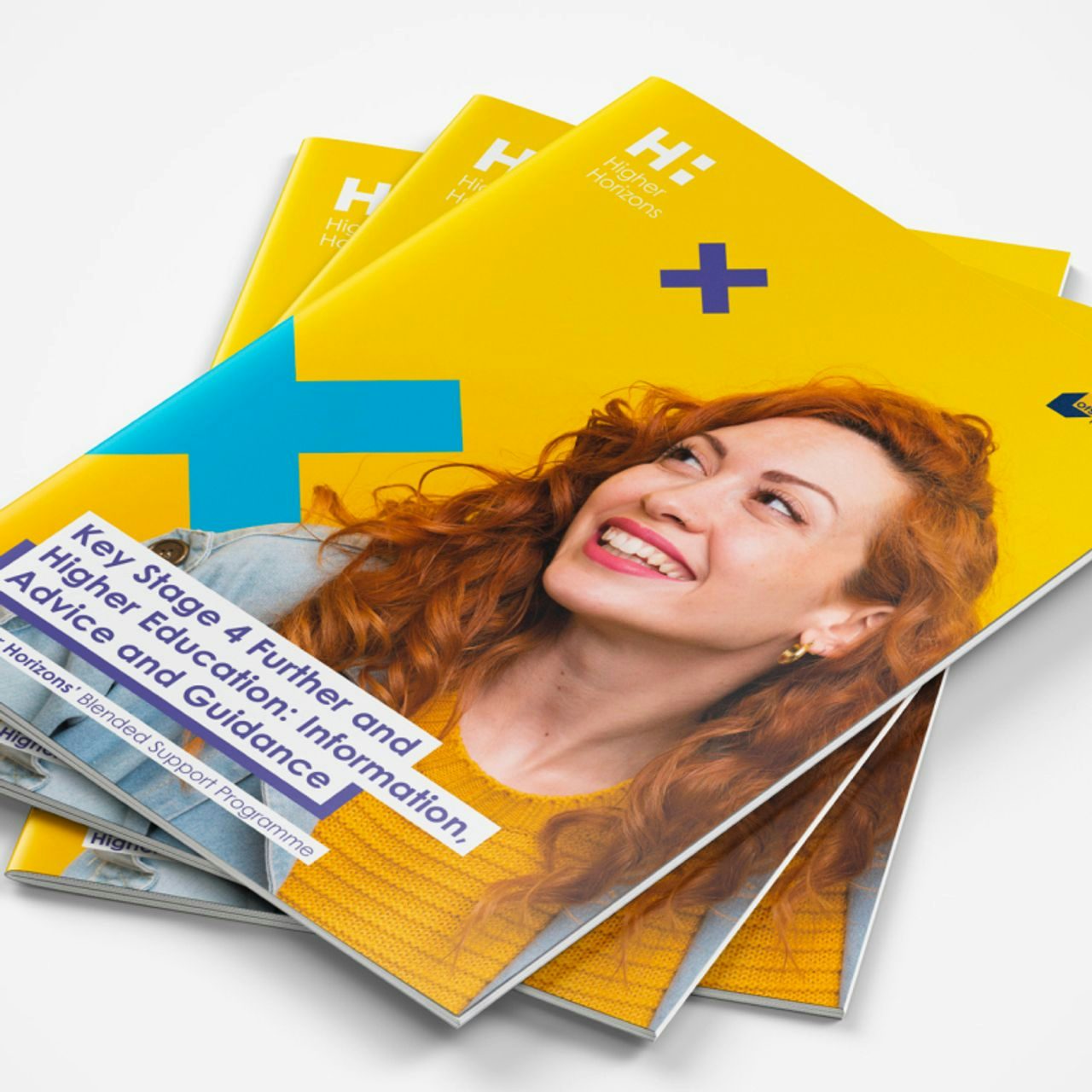
Our ten-year partnership began when the Higher Horizons team approached us to create a brand identity that would enable them to connect with young people, as well as parents and teachers. It needed to clearly reflect their purpose and values, while having the flex and scope to easily evolve over time in response to the changing needs of their audiences, the primary one being late Gen Z.


To reflect the mission of Higher Horizons, we designed a logo that utilises the negative space of the ‘H’ to create building blocks. It represents how the team support young people to build their own future, which may feel inaccessible to a lot of them. As the programme transformed into Higher Horizons+, we developed this logo with a graphical + element which then became a key part of the brand guidelines.
To engage young people aged 13 – 17 years old, we support the team at Higher Horizons to create educational diagrams and easy-to-digest infographics that simplify complex information. Whether illustrating pathways to higher education, top tips for revision or how to apply for university funding, this collateral is designed to remove potential barriers to education, break down overwhelming aspects of the journey and give young people access to the tools they need for success.
As key influencers of our primary target audience, we also needed to educate and engage parents and teachers. Sub-brand colours were strategically chosen to attract these secondary audiences, distinguishing the information from the student assets. Supporting images were a key focus on all brand assets, placing the audience at the centre of the visual to ensure the right people were engaged at the right time.


As the window to the brand, the Higher Horizons website was falling short in engaging users. So, we redeveloped it to improve user experience across all touchpoints and encourage users to interact. By refining the visual design and carefully considering navigation and accessibility, the website now enables users to digest information easily and access support if needed through an online chat service.
During the COVID-19 pandemic, all face-to-face delivery of resources and taster sessions were put on hold. So to keep young people engaged, we created interactive PDFs, PowerPoints and videos to be used online by the Higher Horizons team.


More recently the Higher Horizons team challenged us to push the brand in a new direction on socials to better resonate with late Gen Z in their native spaces outside of the school or college classroom. We developed a refreshed visual style and voice for social content targeting students, that better aligned with their values, trends and experiences interacting with aspirational brands. We made sure it could flex across multiple formats, including infographics and animations. This led to increased web traffic from social, contributing to a 200% increase in web goal conversions.