How do you turn cutting-edge logistics tech into a brand that’s as smart and streamlined as the solutions it delivers?
Data Driven Logistics
Brand, Strategy, Website, SEO, Motion
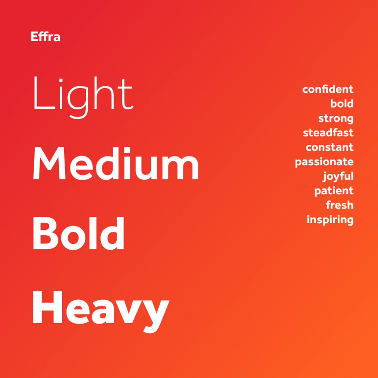
To elevate the Data Driven Logistics brand, we refreshed its visual identity by redesigning the logo to embody the business’ innovative core. This strategic shift extends beyond aesthetics – it works hand-in-hand with the mission and vision of the brand. The result? A cohesive visual identity that communicates a commitment to innovation with clarity and impact.


Following the new visual identity, we designed and built a user-friendly, dynamic website for the technology brand. With a mission to simplify complex software and break down barriers logistics companies often face when searching for a solution, we diffused the jargon, created engaging visual assets and delivered a seamless user experience.
Now we had a solid visual identity and website for the Data Driven Logistics brand, it was time to raise the company profile. So, we created a content strategy to increase awareness and position the brand as a key player in the market.

As a leading software systems developer, Data Driven Logistics wanted to showcase their vast offering of innovative products to current and prospective clients. So, we created a product eco-system animation that visualises the features, benefits and how the products work alongside each other.


The team at Data Driven Logistics subsequently appointed us to develop the brand of a new sister company, DriveSafe. We created a brand identity, key messaging and positioning, and a website with a video animation – aligning the visuals with the Data Driven brand but developing a DriveSafe identity in its own respect.

